Create a simple plot with ggplot2
Introduction
This is a brief example for how to create a simple graph using ggplot2 in R. I am assuming you already have R and RStudio downloaded and ready to go on your system.
This example includes:
- What libraries you need and how to get them
- Importing data to plot
- Creating plots!
You should be able to create a plot similar to this plot by the end, and have resources to learn how to create other plots too!
There are many modifications that are easy to make, once you know how! Hopefully the way I’ve structured the examples, you can find ways to create more types of graphs, and go down the Rstats rabbit hole.
Remember that google is your friend. In the process of creating this document, I had to search for a lot of code to remember how to add certain components.
Libraries
The first step in the process is to install libraries (if needed) and load libraries.
Load libraries
Load all libraries you'll need to create your plot
```r library(tidyverse) library(scales) library(ggthemes) library(gsheet) ```
Install packages if needed
```r install.packages("packageName") ```
Check for packages
If you have successfully installed a package, you should see the package in the 'Packages' tab.
{width=50%}
You can click on a package to see additional information about the package. ## Package descriptions ### tidyverse Includes many helpful packages, including ggplot2. For full list, click on tidyverse package in packages tab. [@R-tidyverse] ### scales Useful for added aesthetics for legends, axes [@R-scales] ### ggthemes Add pre-set themes to plot To use, add line, starting with theme_, list of theme options will pop up. [@R-ggthemes] ### gsheet This package allows you to import a data set from a google sheet. [@R-gsheet] ### ggpubr This package includes the function 'stat_cor' which allows you to add correlation coefficients within a plot. See the Base R Dataset example. [@R-ggpubr] # Import Data To create a plot, you need data. There are multiple options for adding data. You can create dataframe objects in R, you can import datasets, or you can load datasets included in base R.
## Googlesheets In my main example I use googlesheets, but I also include an example for creating a plot using a base R dataset.Add data using a google sheet is a nice option as multiple individuals may be able to add data values.
How to import
Create object 'url'
Create an object named 'url' with the shared google sheet link.
*The setting must be set to anyone with link can view*
The link below is to a sample googlesheet. You can replace your googlesheets share link to import your own data. ```r url <- "https://tinyurl.com/jukc5yen" ```
Import data into data object
To add data, I create the object 'df', importing my googlesheet using the code below.```r df <- gsheet2tbl(url, sheetid = NULL) ```
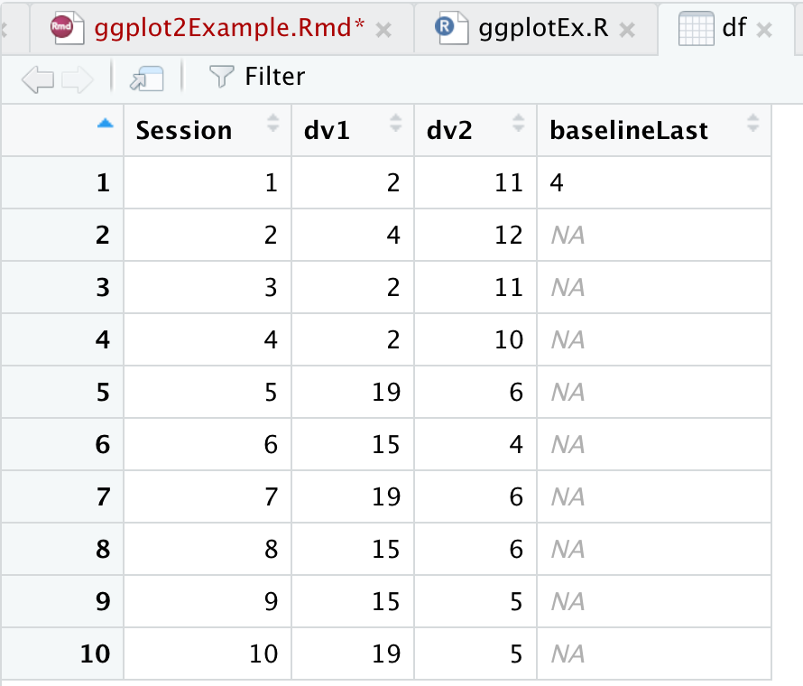
Inspect data
Now I want to check my data to make sure everything looks alright.View data
{width=50%}
Take a glimpse
It's also good to take a glimpse at your dataset to see how the data values are categorized.```r glimpse(df) ``` 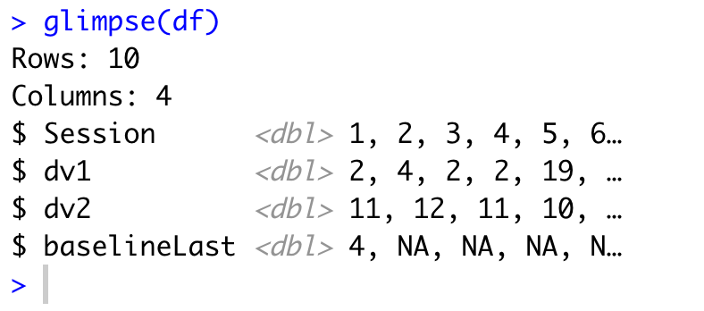{width=50%} Skip to How to Create Plot ## RStudio Import To import a data file in rStudio, find the environment tab. 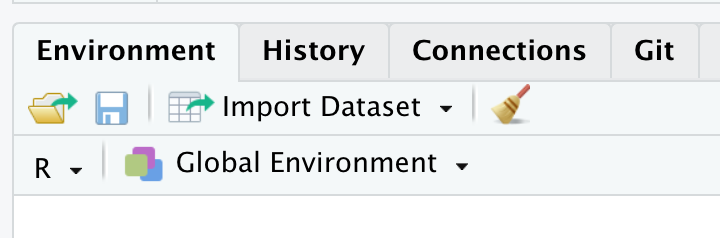{width=50%} ## Base R Datasets
Base R datasets
R includes a number of datasets which are nice for practicing skills in R. You do not need to load this package, it loads automatically when you open rStudio (*I think) To view all included datasets with descriptions, copy and paste this line in the console and run: ```r library(help = "datasets") ``` 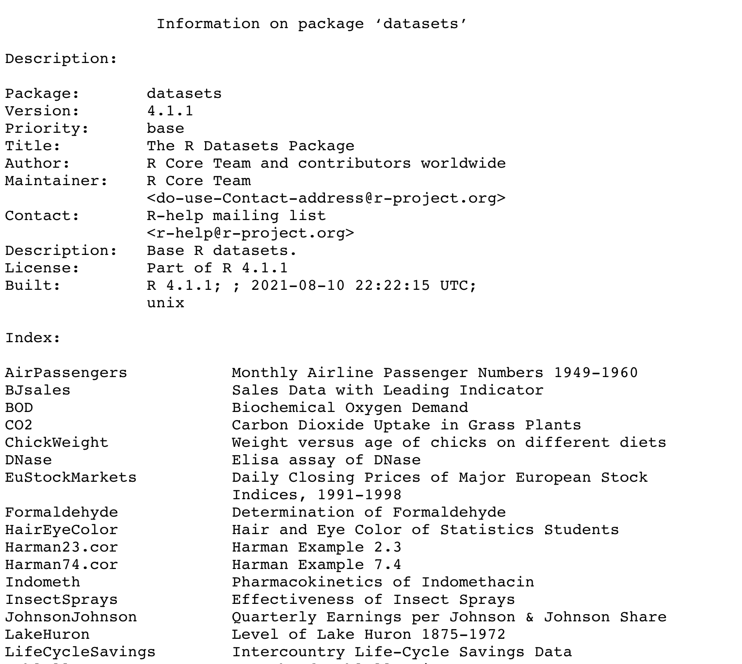{width=75%}Example with mtcars dataset
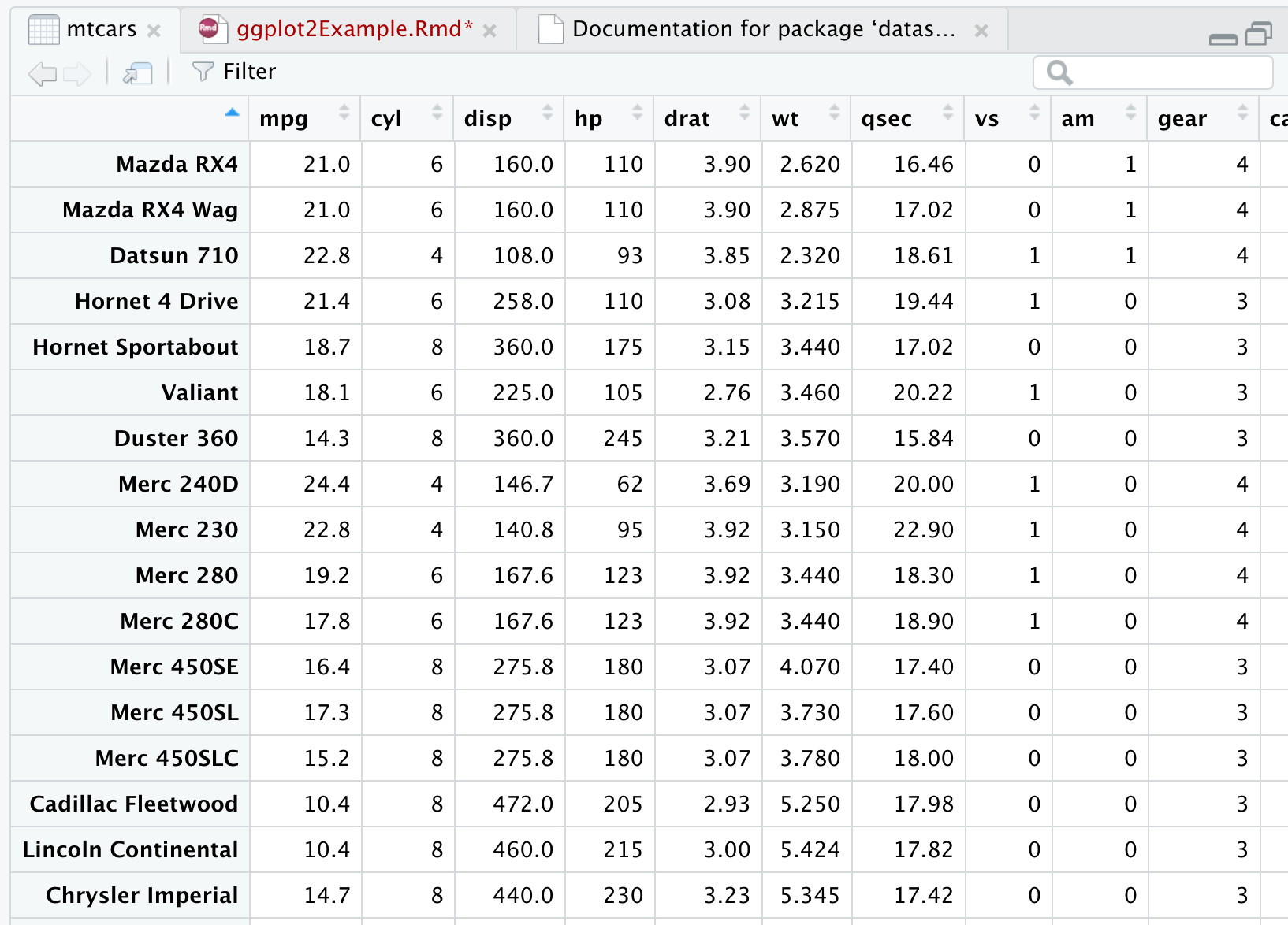
A common data set used in examples, including rMarkdown templates is the ‘mtcars’ data set. To view ‘mtcars’ add
view(mtcars)
 {width=50%}
We can create a simple plot using the mtcars dataset.
carP <- mtcars %>%
      ggplot(aes(x=wt,y=mpg)) +
      geom_point()

ggsave("carP.png", path="images/ggplot/")

carP
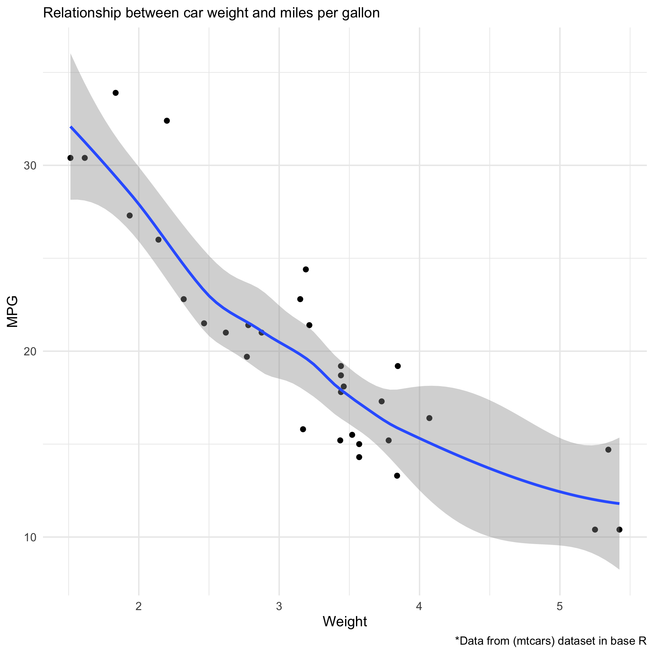
Scatterplot 'carP'
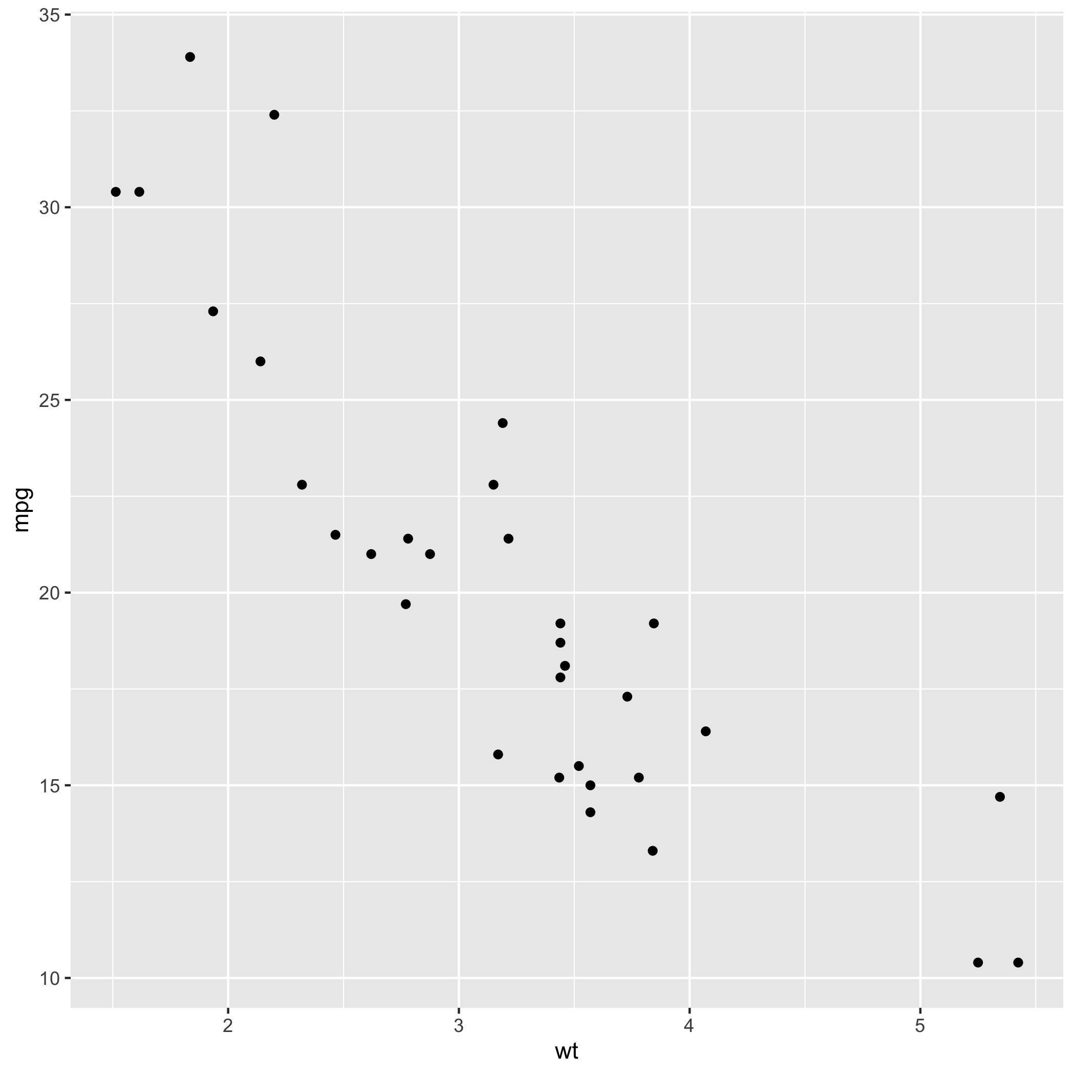 In the above example, I created a scatterplot showing the relationship between car weight and miles per gallon.How the code works
- Create plot object'p<-' creates an object called 'p' which I can callback later on. - Declare data to use in plot
'mtcars %>%' says, with this data set[mtcars] do this next[%>%] - Create plot
'ggplot()' is our main plot call - Add aesthetic mapping
within 'ggplot()' we add aesthetic mapping, which variables should be mapped to the x-axis, y-axis, and other aesthetic values such as color, size, transparency (alpha value)
Add a regression line
We can add a regression line with an extra line 'geom_smooth()' and add a theme with 'theme_fivethirtyeight()' and labels with labs() ```r carP2 <- carP + geom_smooth()+ theme_minimal()+ labs( subtitle = "Relationship between car weight and miles per gallon ", x= "Weight", y= "MPG", caption = "*Data from (mtcars) dataset in base R" ) ggsave("carP2.png", path="images/ggplot/") ```Here's the plot with regression
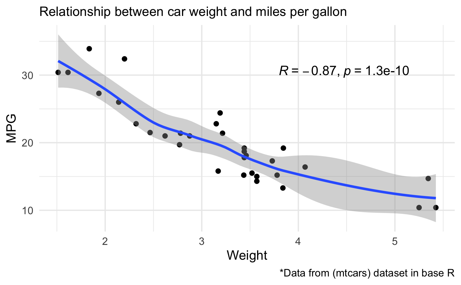
 ```r posY <- max(mtcars$mpg*.9) posX <- max(mtcars$wt*.7) carP3 <- carP2 + stat_cor(method = "pearson", cor.coef.name="R", label.x = posX, label.y = posY) carP3 ggsave("carP3.png", path="images/ggplot/") ```Here's the plot with Pearson coefficient
 # How to Create PlotImport Data
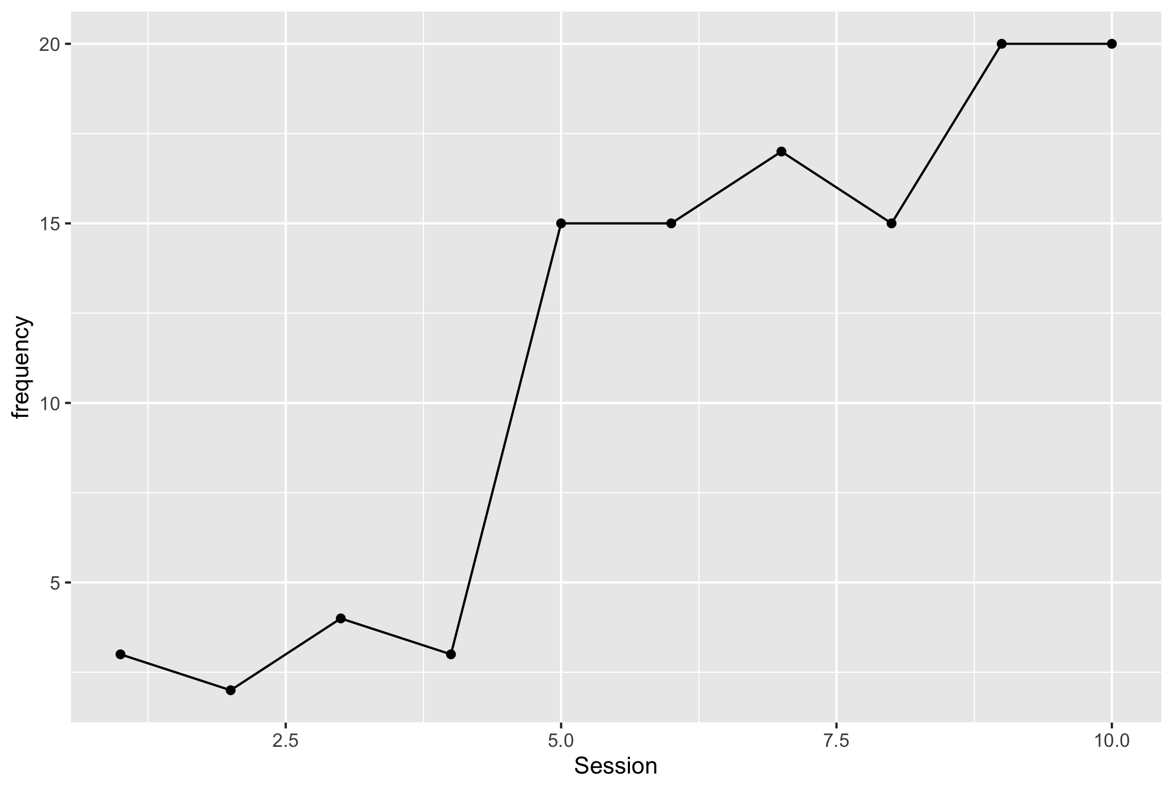
Here is the script for adding data from googlesheet. ```r # create 'url' object url <- "https://tinyurl.com/jukc5yen" #import data df <- gsheet2tbl(url, sheetid = NULL) # view dataframe view(df) # glimpse dataframe glimpse(df) ``` ## Break down the basic script ```r # create plot object p<- # connect dataframe to plot p<- df # use pipe (%>%) to tell program to take df, then ( %>% ) make a plot p <- df %>% ggplot(aes(x,y)) #map x and y values within the aes() p<- df %>% ggplot(aes(x=Session, y=frequency)) # add line and data points with geom_line() and geom_point() p<- df %>% ggplot(aes(x=Session, y=frequency))+ geom_line()+ geom_point() # print plot 'p' p ``` ## Create Basic Plot ```r p <- df %>% ggplot(aes(x=Session, y=frequency))+ # geom line add the line to the graph, you can change the weight, color, etc. geom_line()+ # geom_point adds a shape. geom_point() p #save plot ggsave("p.png", path="images/ggplot/") ```p Plot - Basic Plot
{width=100%} ## Add formattingAdd theme, fix x-axis, group-by treatment phase
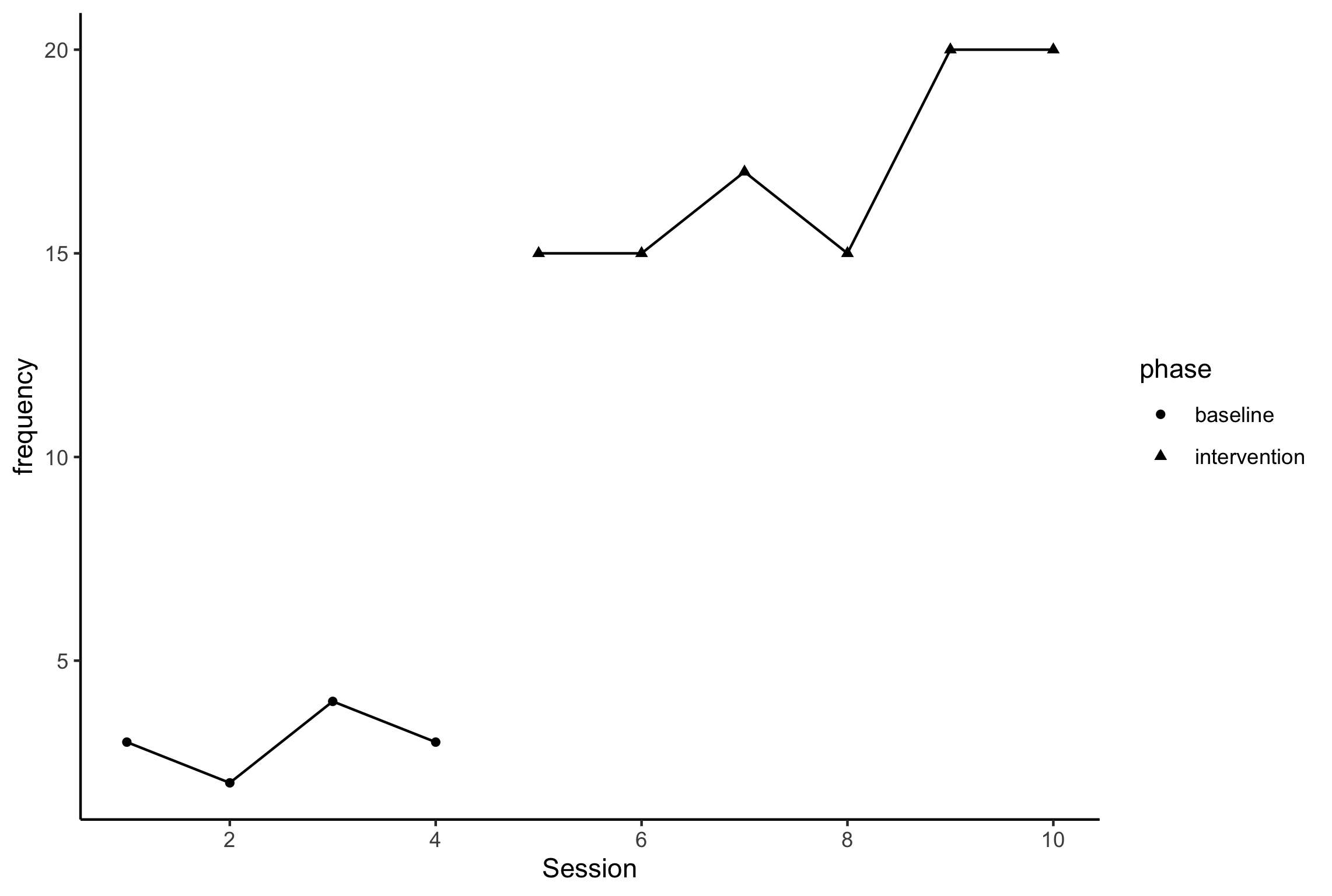
Notes
- Note 1:Notice the added AES group=phase and shape=phase, this adds a different shape for intervention and baseline values. it also splits the datapath. because we added aes to shape, we now have a shape legend
- Note 2:
Adding the scale_x_continuous with breaks_pretty automatically chooses x-axis intervals with whole number values ```r p1 <- df %>% #Note 1 ggplot(aes(x=Session, y=frequency, group=phase, shape=phase))+ # geom line add the line to the graph, you can change the weight, color, etc. geom_line()+ # geom_point adds a shape. geom_point()+ #add theme classic (from pkg ggthemes) and see the changes theme_classic()+ #Note 2 scale_x_continuous(breaks=breaks_pretty()) p1 ggsave("p1.png", path="images/ggplot/") ```
p1 Plot - Added Formatting
{width=100%} ## Add labelsAdd Labels without creating new plot
We can add labels without starting a new plot, but creating a new object 'p1Labs' and adding it as layers to p1
p1Labs <- p1 +
  labs(
    title = "Title",
    subtitle="Subtitle",
    caption="caption",
    y="Frequency",
    x="Session",
  )+
  #remove legend title
  theme(
    legend.title = element_blank()
  )+
  #modify names of legend
  scale_shape_discrete(
    labels = c("Baseline","Intervention")
  )

p1Labs

ggsave("p1Labs.png", path="images/ggplot/")
p1Labs
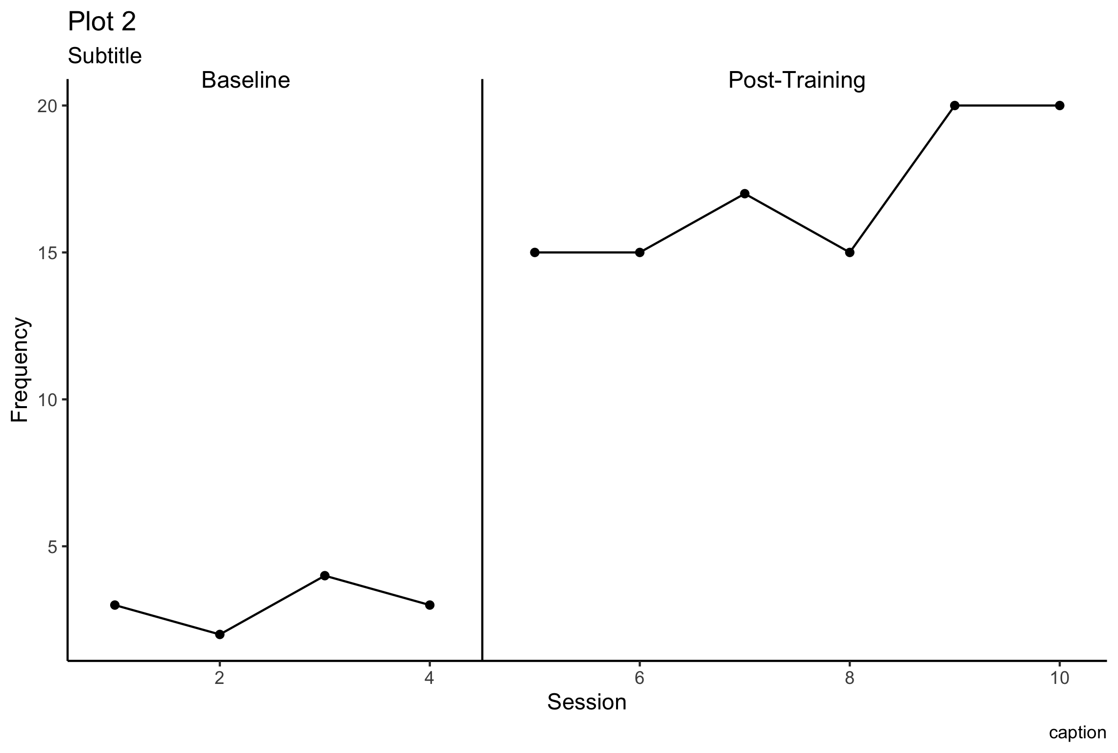
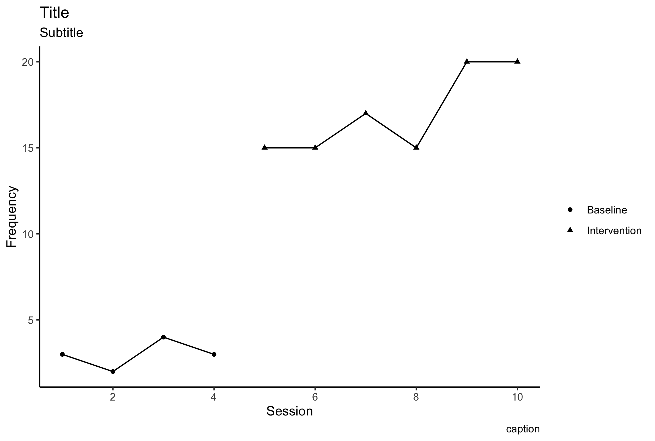{width=80%}What if you want to have a plot with a phase change line instead? Click on phase line tab to see# Add Phase Line
Add Phase Line
Let's create the graph with a slightly different format, so we can include a phase change line. First we'll create a basic graph, grouping data series by phase. ```r p2 <- df %>% ggplot(aes(x=Session, y=frequency, group=phase))+ # geom line add the line to the graph, you can change the weight, color, etc. geom_line()+ # geom_point adds a shape. This time we tell it to include a circle shape. geom_point(shape="circle")+ # We can copy and past the labs code above here labs( title = "Title", subtitle="Subtitle", caption="caption", y="Frequency", x="Session", )+ # add theme_classic (or try other options!) theme_classic()+ # copy and past formatting for x-axis (remember, pretty breaks) scale_x_continuous(breaks=breaks_pretty()) p2 ggsave("p2.png", path="images/ggplot/") ```p2 Plot
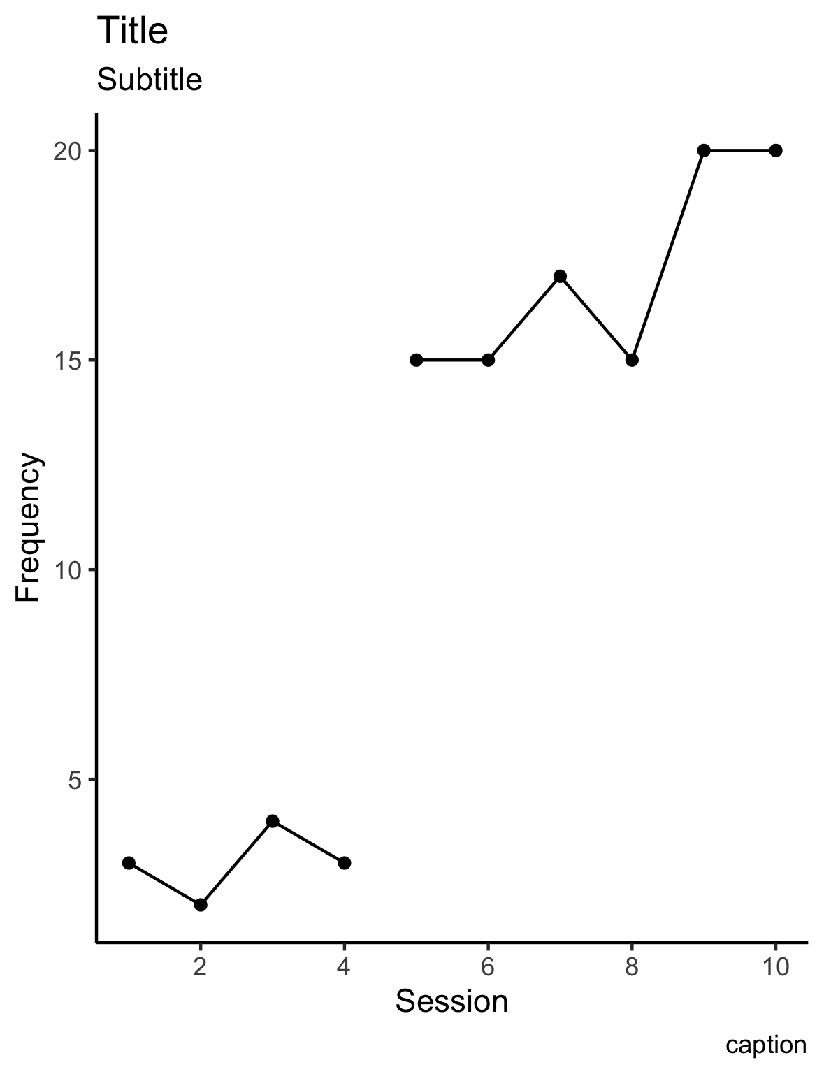 {width=80%}
Add phase lines and labels
Now we can add phase lines and labels
The first few lines of code create a variable that I can add later on. In order to create the phase change line I will be adding a line segment using ‘annotate’. I tell the program where to start the segment, and where to end the segment using the starting values x and y, and the end values xend, and yend.
# add session number of final baseline phase
lastPhase = 4

# create value for x-value in line segment using 'lastPhase'
phaseX = lastPhase+.5

#check value of newly created phaseX
phaseX
My new variable ‘phaseX’ says where the line should land on the x-axis. The benefit of creating ‘phaseX’ is that regardless of my df, it should identify the correct phase change location. If my x-axis includes date values, I will have to adjust the code slightly.
p2phase <- p2 +
annotate("segment",
       x=phaseX,
       xend=phaseX,
       y=-Inf,
       yend=Inf)+
# y=Inf means the line will extend to the maximum value of the chart
annotate("text", label="Baseline", x=2.25, y=Inf, size=4)+
annotate("text", label="Post-Training", x=phaseX+3, y=Inf, size=4)+
labs(
title="Plot 2"
)+
# without this line, the labels at y=Inf will be cut off
coord_cartesian(clip = "off")

p2phase


ggsave("p2phase.png", path="images/ggplot/")
You might notice in the ‘annotate’ formating, my y-values say ‘y =-Inf’and ‘yend = Inf’. Inf indicates the maximum y-value possible.
{width=80%}
Resources
Read More
Data Types
You may have noticed that all of our vectors are categorized as. is one of many data types, and can be converted to other data types.
You can read more about data types here:
- [Converting data types](“http://www.cookbook-r.com/Manipulating_data/Converting_between_vector_types/")
- [Data types from data camp](“https://www.datacamp.com/community/tutorials/data-types-in-r")
Glimpse
Find out more ways you can apply glimpse() in the dplyr package here:
You can read more about glimpse here:
- [More on using glimpse()](“https://www.exploringdata.org/post/examining-data-with-glimpse/")
More resources
- [Annotations](“https://ggplot2.tidyverse.org/reference/annotate.html")
Show your google chops!
Remember to google. Stack overflow is a great resource. RStudio also has many good resources. The truth is out there. Good luck!<svg aria-hidden="true" role="img" viewBox="0 0 448 512" style="height:1em;width:0.88em;vertical-align:-0.125em;margin-left:auto;margin-right:auto;font-size:inherit;fill:gray;overflow:visible;position:relative;"><path d="M448 32c-83.3 11-166.8 22-250 33-92 12.5-163.3 86.7-169 180-3.3 55.5 18 109.5 57.8 148.2L0 480c83.3-11 166.5-22 249.8-33 91.8-12.5 163.3-86.8 168.7-179.8 3.5-55.5-18-109.5-57.7-148.2L448 32zm-79.7 232.3c-4.2 79.5-74 139.2-152.8 134.5-79.5-4.7-140.7-71-136.3-151 4.5-79.2 74.3-139.3 153-134.5 79.3 4.7 140.5 71 136.1 151z"/></svg>{=html} About Me

I’m Kerry, a relatively new R user. I like researching human development and learning, and finding more efficient ways to help people learn new skills. You can see more about me at my website
I am a self-taught ggplot user, and benefitted from all of the free user guides and message boards. I hope this document might help get you started.
<svg aria-hidden="true" role="img" viewBox="0 0 512 512" style="height:1em;width:1em;vertical-align:-0.125em;margin-left:auto;margin-right:auto;font-size:inherit;fill:steelblue;overflow:visible;position:relative;"><path d="M459.37 151.716c.325 4.548.325 9.097.325 13.645 0 138.72-105.583 298.558-298.558 298.558-59.452 0-114.68-17.219-161.137-47.106 8.447.974 16.568 1.299 25.34 1.299 49.055 0 94.213-16.568 130.274-44.832-46.132-.975-84.792-31.188-98.112-72.772 6.498.974 12.995 1.624 19.818 1.624 9.421 0 18.843-1.3 27.614-3.573-48.081-9.747-84.143-51.98-84.143-102.985v-1.299c13.969 7.797 30.214 12.67 47.431 13.319-28.264-18.843-46.781-51.005-46.781-87.391 0-19.492 5.197-37.36 14.294-52.954 51.655 63.675 129.3 105.258 216.365 109.807-1.624-7.797-2.599-15.918-2.599-24.04 0-57.828 46.782-104.934 104.934-104.934 30.213 0 57.502 12.67 76.67 33.137 23.715-4.548 46.456-13.32 66.599-25.34-7.798 24.366-24.366 44.833-46.132 57.827 21.117-2.273 41.584-8.122 60.426-16.243-14.292 20.791-32.161 39.308-52.628 54.253z"/></svg>{=html} Connect
Please feel free to send suggestions,ask me questions, and let me know if you want to collaborate to add to this document!
<svg aria-hidden="true" role="img" viewBox="0 0 640 512" style="height:1em;width:1.25em;vertical-align:-0.125em;margin-left:auto;margin-right:auto;font-size:inherit;fill:steelblue;overflow:visible;position:relative;"><path d="M192 384h192c53 0 96-43 96-96h32c70.6 0 128-57.4 128-128S582.6 32 512 32H120c-13.3 0-24 10.7-24 24v232c0 53 43 96 96 96zM512 96c35.3 0 64 28.7 64 64s-28.7 64-64 64h-32V96h32zm47.7 384H48.3c-47.6 0-61-64-36-64h583.3c25 0 11.8 64-35.9 64z"/></svg>{=html} Coffee
I hope this page helps get your started with ggplot.
If this tutorial helped get you started with ggplot, feel free to buy me a coffee (”[at]kerry-shea”), or better yet, share what you learn with others!
This was created using rMarkdown and the ‘readthedown’ theme from rmdformats package [@R-rmdformats].
References
Kerry A. Shea
Senior Research Scientist
I’m interested infant learning processes. I’m also interested in learning more about effective strategies to support caregivers to provide nurturing care environments. This is my personal page for me to share resources, musings, and everything in between.